
This is not possible in the new lobby: https://boardgamearena.com/forum/viewto ... &start=120 You can use the "oldie but goldie" lobby fo thisWhiteWitch79 wrote: ↑15 December 2022, 14:32 I can't find out how to start a second game before all have accepted the first. Does anyone have a clue how do to it?
New game page
Re: New game page
#zan_zendegi_azadi / #woman_life_freedom
#StandWithUkraine
Language is a source of misunderstanding. (Antoine de Saint-Exupery: The Little Prince) But it is also the source of understanding - it all depends on how you use it.
#StandWithUkraine
Language is a source of misunderstanding. (Antoine de Saint-Exupery: The Little Prince) But it is also the source of understanding - it all depends on how you use it.
Re: New game page
For further information, check discussion here: https://boardgamearena.com/forum/viewtopic.php?t=28186 and here: https://boardgamearena.com/forum/viewtopic.php?t=28412.zizzeus wrote: ↑10 January 2023, 22:10 However, many of my games are between RL friends, with ranking, and no time limit as we always finish them. At least they were, until that option was removed. I think it's a common enough use case that you should re-enable it. Someone mentioned being stuck in a game that wouldn't end, but as I recall, after about a month those games would just delete on their own, so this isn't really a problem. Plus, there was a very clear warning not to use this option with people you don't know IRL.
I like to be able to go away for the weekend, not use a vacation timer, and not worry about karma or someone inadvertently ending a game by clicking that option.
Please allow no time limit ranked games again. Training is not a suitable replacement as players often want to build up enough ELO to play in Arena, which cannot be done in Training Mode.
And don't forget to vote for the suggestion to bring no time-limit back: https://boardgamearena.com/bug?id=78071
#zan_zendegi_azadi / #woman_life_freedom
#StandWithUkraine
Language is a source of misunderstanding. (Antoine de Saint-Exupery: The Little Prince) But it is also the source of understanding - it all depends on how you use it.
#StandWithUkraine
Language is a source of misunderstanding. (Antoine de Saint-Exupery: The Little Prince) But it is also the source of understanding - it all depends on how you use it.
Re: New game page
There is another way finding a game to start in the Play Now menu: You can find a special search bar for this BELOW your favorites. If you start a game using this feature, it is automatically added to your favorites.TrinaCat wrote: ↑29 December 2022, 10:17 Yes, I can still use the old fully functional game creation as long as I start in the Play Now menu. For a game I haven't played before or have removed from my favorites, that means finding the game, adding to it to favorites so it will show on Play Now then going through there, which is clunky but manageable now that I know the workaround.
#zan_zendegi_azadi / #woman_life_freedom
#StandWithUkraine
Language is a source of misunderstanding. (Antoine de Saint-Exupery: The Little Prince) But it is also the source of understanding - it all depends on how you use it.
#StandWithUkraine
Language is a source of misunderstanding. (Antoine de Saint-Exupery: The Little Prince) But it is also the source of understanding - it all depends on how you use it.
-
RicardoRix

- Posts: 2115
- Joined: 29 April 2012, 23:43
Re: New game page
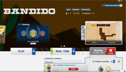
Setting up a new game, the game defaults to real-time, although I play mainly turn-based.
After inviting a friend and realise I'm in real-time, I switch to turn-based, but that then uninvites my friend I invited.
--------------
some very bad things happened after this that I can't explain.
The yellow(turn-based) blobby thing (does this have a name?) turned green(real-time) and thought I was trying to still play a real-time game. Several times I clicked cancel, but the green blobby thing wouldn't go away and the game was perhaps reverting back to real-time...?? IDK, not sure, after frantic cancel clicking eventually green blobby went away.

Re: New game page
Quick semi-related question ....
Is there *anywhere* where a full text list of all games on BGA is listed? I must've had one at some time (I have a spreadsheet that shows all the games at the time; and I had marked some as "play" and some as "learn" -- but I'd love to update that with all the new releases.
I see there's a page for "All Games" - but it's not in text / copyable format .....
Re: New game page
it's really difficult to start a new game in the new page. you say it's intuitive but i can't figure anything out:
- loses my preferences of skill level so i end up in a game with people who are either too challenging and/or too easy
- can't figure out where the setting is to restrict by reputation
- the page takes up so much space i have to scroll down to see the options
- why is everything scrunched on the right side of the page?
most importantly, it's annoying that i am taken to the new page any time i try to play again or rematch. by the time i figure out what the heck i'm doing sometimes everyone has started a new game and i'm left out
-
TeddyCuoreDolce

- Posts: 1
- Joined: 25 August 2020, 13:57
Re: New game page
I usually don't comment on design. People naturally tend to resist changes. But this one I think is really a mistake.
What do I want from a game table screen? I want information about the table and participants.
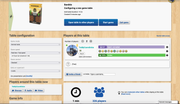
Maybe it's not the prettiest, but the old interface does just that. The 3 main visible sections are table management, configuration and players cards with all relevant info about them in the game.
What is the new interface telling the user instead? Almost all screen space is given to useless information:
- Other in-progress games
- Tutorials
- Game stats (completion time, complexity, amount of players)
- My own ELO
All of which I could expect from a game screen, not a table screen. Nothing here tells me anything useful about the table itself.
Answer me this question:
- What is the ELO and reputation of the player that just joined?
- What rules are we playing with?
What do I want from a game table screen? I want information about the table and participants.
Maybe it's not the prettiest, but the old interface does just that. The 3 main visible sections are table management, configuration and players cards with all relevant info about them in the game.
What is the new interface telling the user instead? Almost all screen space is given to useless information:
- Other in-progress games
- Tutorials
- Game stats (completion time, complexity, amount of players)
- My own ELO
All of which I could expect from a game screen, not a table screen. Nothing here tells me anything useful about the table itself.
Answer me this question:
- What is the ELO and reputation of the player that just joined?
- What rules are we playing with?

Re: New game page
Intuitive? As Inigo Montoya famously said, “You keep using that word. I do not think it means what you think it means.”
Re: New game page
I fully agree. What people were really missing on the old game page was a comfortable way to start a game from there. All that was needed was a link to the old lobby, immediately jumping to a new table prefilled with the selection of this game. So easy!TeddyCuoreDolce wrote: ↑24 January 2023, 12:46 I usually don't comment on design. People naturally tend to resist changes. But this one I think is really a mistake.
What do I want from a game table screen? I want information about the table and participants.
Maybe it's not the prettiest, but the old interface does just that. The 3 main visible sections are table management, configuration and players cards with all relevant info about them in the game.
What is the new interface telling the user instead? Almost all screen space is given to useless information:
- Other in-progress games
- Tutorials
- Game stats (completion time, complexity, amount of players)
- My own ELO
All of which I could expect from a game screen, not a table screen. Nothing here tells me anything useful about the table itself.
Answer me this question:
- What is the ELO and reputation of the player that just joined?
- What rules are we playing with?
#zan_zendegi_azadi / #woman_life_freedom
#StandWithUkraine
Language is a source of misunderstanding. (Antoine de Saint-Exupery: The Little Prince) But it is also the source of understanding - it all depends on how you use it.
#StandWithUkraine
Language is a source of misunderstanding. (Antoine de Saint-Exupery: The Little Prince) But it is also the source of understanding - it all depends on how you use it.
-
Deadly_Rose

- Posts: 12
- Joined: 09 May 2020, 17:07
Re: New game page
I hadn't come on the website for a while and I agree with this comment
On top of it when I want to uncheck the "I want to play with players speaking x language" I can't do it, it keeps telling me to check at least one of the boxes but ALL of them are already checked.
TeddyCuoreDolce wrote: ↑24 January 2023, 12:46 I usually don't comment on design. People naturally tend to resist changes. But this one I think is really a mistake.
What do I want from a game table screen? I want information about the table and participants.
Maybe it's not the prettiest, but the old interface does just that. The 3 main visible sections are table management, configuration and players cards with all relevant info about them in the game.
What is the new interface telling the user instead? Almost all screen space is given to useless information:
- Other in-progress games
- Tutorials
- Game stats (completion time, complexity, amount of players)
- My own ELO
All of which I could expect from a game screen, not a table screen. Nothing here tells me anything useful about the table itself.
Answer me this question:
- What is the ELO and reputation of the player that just joined?
- What rules are we playing with?
On top of it when I want to uncheck the "I want to play with players speaking x language" I can't do it, it keeps telling me to check at least one of the boxes but ALL of them are already checked.