Page 2 of 4
Re: Old Graphics are better than the original
Posted: 13 July 2022, 22:18
by Yorgad
Here is a constructive feedback:
Saturation
High saturation for gameplay, low saturation for decorative element. Saturation is eye-catching
Contrast
Contrast improves readability, black text over uniform pale blackground is recommended
Cluttering/Simplicity
Less is more, consider flat design, remove unnecessary frames
Trust your players intelligence: use bold font to emphasis "I DEMAND" action (bold font is universally known)
I an absolutely not a huge fan of the new hexagonal coloured logos, they respect none of the above:
The new logos colouring scheme is confusing with the other symbol colors (red vs. factories, green vs. leave, yellow vs. crown)
The new logos colouring is redundant with the card background
The new logos are distracting due to their complexity (large palette of colors)
A black and white, or shades of grey would make them neutral, as they are supposed to be
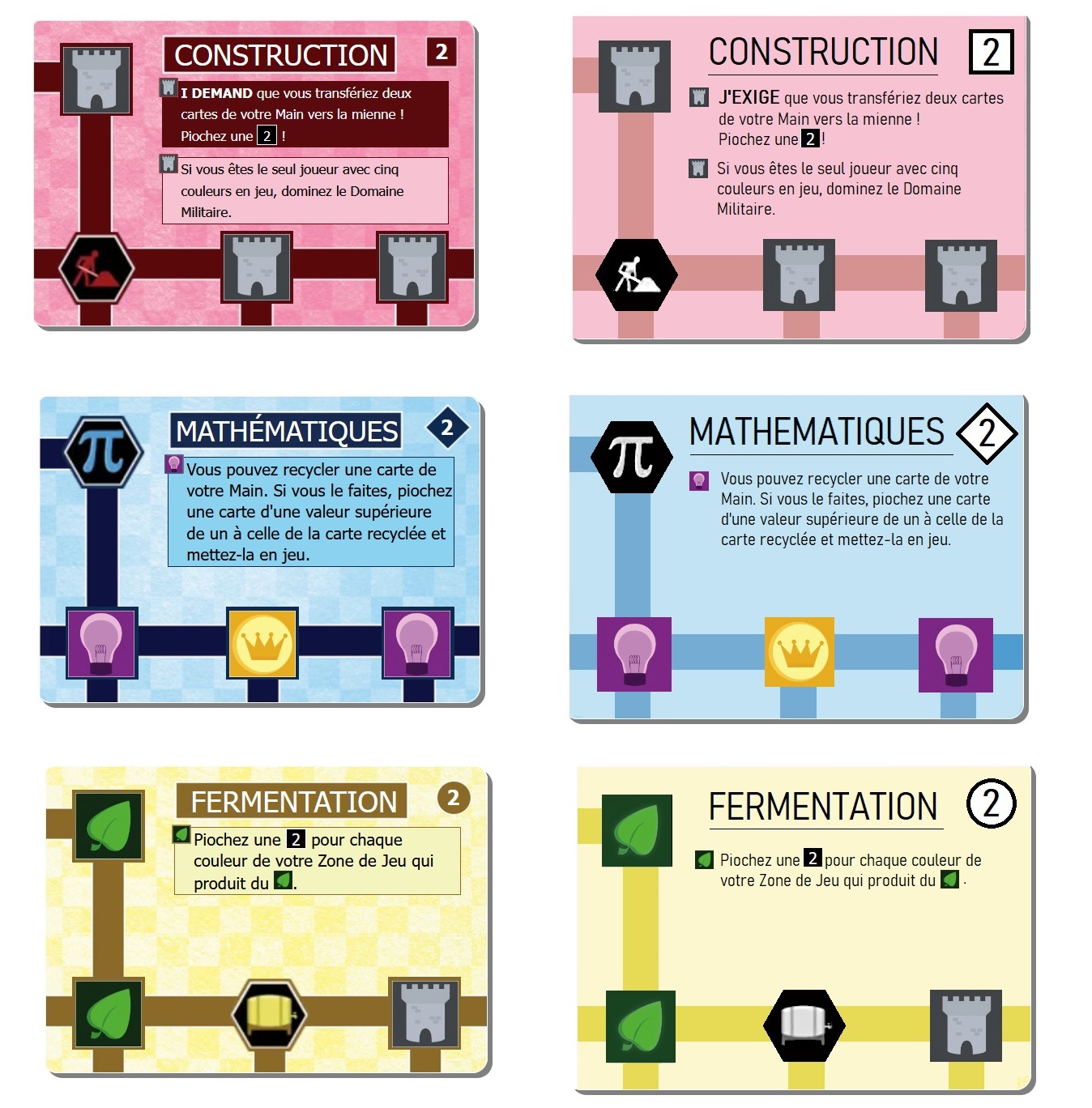
Look what some simplification can do:
- innovation.jpg (408.98 KiB) Viewed 1165 times
Hint: any resemblance to an older version is purely coincidental

Cheers,
Y.
Re: Old Graphics are better than the original
Posted: 13 July 2022, 22:39
by lordmcfuzz
Please be aware of what the real life cards look like today, the ones that you can buy at your local gaming store.
Re: Old Graphics are better than the original
Posted: 13 July 2022, 22:43
by Sloth-DMV
At risk of quoting WarGames: BGA, after very careful consideration, sir, I've come to the conclusion that your new Innovation system sucks.
Re: Old Graphics are better than the original
Posted: 13 July 2022, 22:51
by Yorgad
lordmcfuzz wrote: ↑13 July 2022, 22:39
Please be aware of what the real life cards look like today, the ones that you can buy at your local gaming store.
Oh I believe most of us are well aware of this, it's just that digital copy (screen) dramatizes the design flaws introduced in the 3rd version (not your fault). Sometimes some adaptations are needed to ensure some ergonomic basics (eyes fatigue, dyslexia, etc.)
Again thanks for the updates anyway!
Cheers,
Y.
Re: Old Graphics are better than the original
Posted: 13 July 2022, 23:12
by CptnWolFox
I like the new design on the cards in real life, but the cards are harder to read here. The text on the cards is smaller, for sure. I am not sure why, since the cards are the same size and the icons are smaller than the old ones. Maybe allow the text box to be closer to the title of the card and allow the text to underhang the featured icon indicator as in the previous graphics. That might allow the text to be bigger.
Also, the backs of the cards have a really thick white border, which makes them difficult to read.
Re: Old Graphics are better than the original
Posted: 13 July 2022, 23:34
by mstranslate
PLEASE let me choose which set of images I want to use when I'm setting up the game. Please, please, please. This game is what got me through the worst of the pandemic and I am going into withdrawal now.
Re: Old Graphics are better than the original
Posted: 14 July 2022, 00:29
by Lidhuin
Just had my first game of innovation in a while.
Saw the new card graphics and pretty much noped out. While I know the cards, it's still extremely difficult to read them. If I'm having difficulty, new players are bound to have an even harder time.
I'm with the other person who is likely going to refrain from playing, not out of protest, but because the graphics makes the game the opposite of enjoyable.
Re: Old Graphics are better than the original
Posted: 14 July 2022, 00:36
by Yorgad
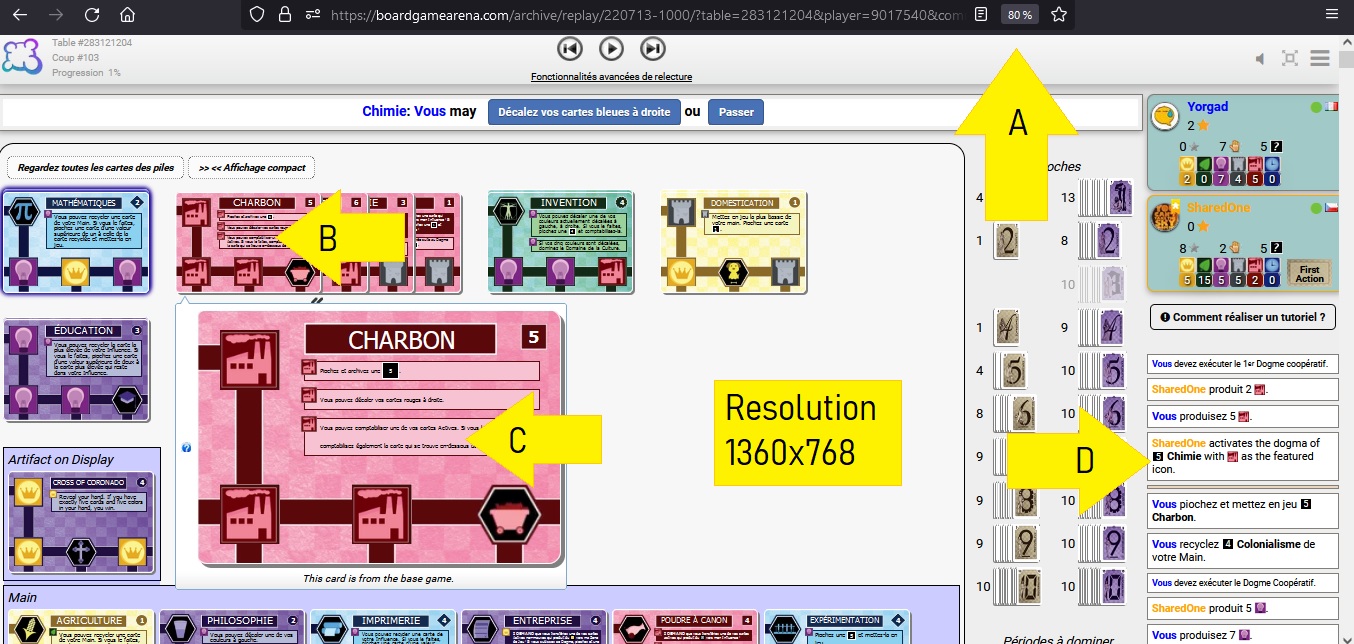
Another feedback on readability (text too small)
Please find below a screenshot to illustrate.
I use Firefox 102 64bit
I have a screen resolution of 1360x768
Notes
A: I use a 80% zoom to allow the display of the decks on the right side
B: This is what can be read with the actual card
C: this is the magnified card
D: This is the BGA font for reference
On the previous version I could still read the text on image even with a zoom of 70%. Sadly I cannot share a screenshot for comparison since I cannot revert to the previous edition.
- Innovation look&feel80.jpg (309.66 KiB) Viewed 1126 times
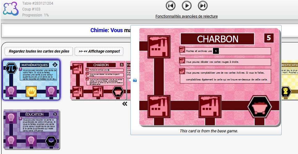
And a screeshot with 100% zoom, still too small.
- Innovation look&feel100.jpg (159.15 KiB) Viewed 1126 times
Cheers,
Y.
Re: Old Graphics are better than the original
Posted: 14 July 2022, 00:47
by campbe11
Ecogeek wrote: ↑13 July 2022, 16:29
FYI: I believe they changed the graphics to fit the expansions. So if I understand that correctly, if you wanted to have old graphics you'd have to play without expansions. That could be an option, but it would be tricky, I think to impliment.
Shouldn't it be simple enough, to let the new cards be their terrible unreadable selves but let the old cards be displayed in the very nicely legible way as before? I could deal with the new ones being cryptographic, if the existing cards didn't make blue/green an almost indistinguishable difference and all text subject to a microscope.
Re: Old Graphics are better than the original
Posted: 14 July 2022, 01:23
by blockmonoid
Yorgad, you can get a screenshot of the old cards if you replay a game from before the update today. Go to your game history and replay a game from a week ago, like this one:
https://boardgamearena.com/gamereview?table=282584668