i second whoever indicated that the 5 and 6 on the card backs are confusing .. also potentially confused are the 3 and the 8.
i have dropped the game from my faves.
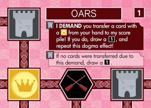
anyway, i don't blame the dev on the online port .. but the original designer of the physical cards was off the deep end. go crazy if you want to do something funky with the icons .. there are only 6 of them, so people can get used to them quickly, since they are meant to be ICONic. but putting in changes that affect LEGIBILITY is a big no.no in any game that requires actual READING.
* the blue and green coloured cards are nearly indistinguishable (and i can't imagine how someone colourblind will deal with these). if they were willing to go with white text on dark red for the red cards, they should have been willing to go with white text on dark green for the green cards. the green cards should have been the colour of the leaf symbol, with the leaf symbol going pastel.
* better yet, keep all the text black and confine the funky checkerboard background to only the card edges
* the inactive icons should have stayed colourless .. OR become stylized as part of the card edge and remove the black so that they can never be mistaken for active icons
* font on the card backs should have been chosen more carefully .. failing that, if you want the extra illustration, don't cover up the number. or heck, put a roman numeral in the top right corner as a failsafe.
