Page 3 of 4
Re: Old Graphics are better than the original
Posted: 14 July 2022, 02:52
by Yorgad
Thanks I could'nt retrieve the card I took in my previous screenshot, but I found another one for side by side comparison. I think it illustrates quite well how the text becomed unreadable for most of us.

Right click on the image to enlarge!
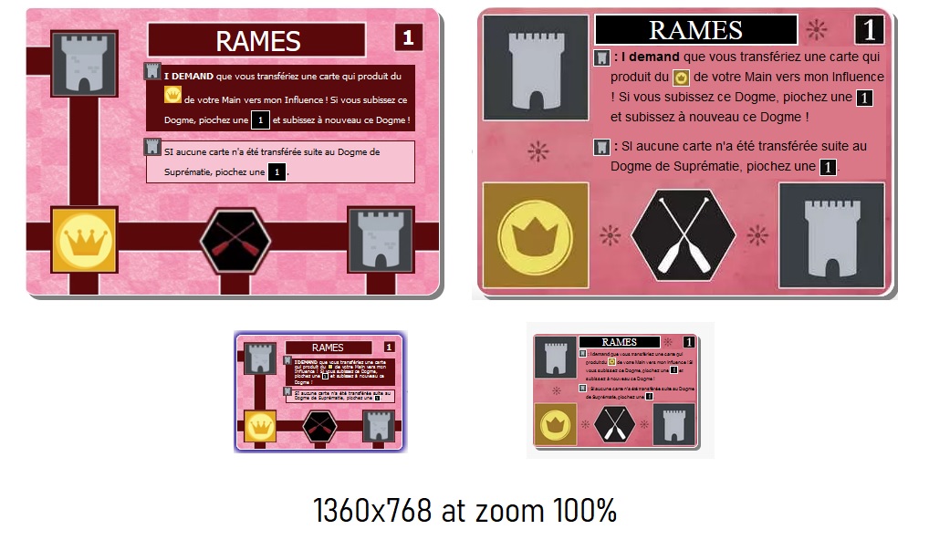
- Comparison100.jpg (162.54 KiB) Viewed 1668 times
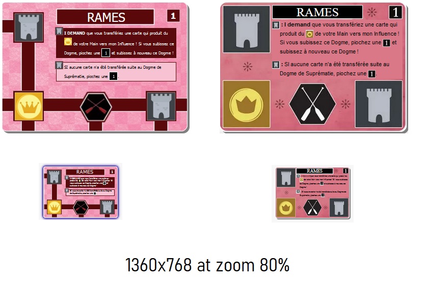
- Comparison80.jpg (120.39 KiB) Viewed 1668 times
Cheers,
Y.
Re: Old Graphics are better than the original
Posted: 14 July 2022, 04:25
by Babyrhinorainbows
.
Re: Old Graphics are better than the official
Posted: 14 July 2022, 05:18
by senatorhung
i second whoever indicated that the 5 and 6 on the card backs are confusing .. also potentially confused are the 3 and the 8.
i have dropped the game from my faves.
anyway, i don't blame the dev on the online port .. but the original designer of the physical cards was off the deep end. go crazy if you want to do something funky with the icons .. there are only 6 of them, so people can get used to them quickly, since they are meant to be ICONic. but putting in changes that affect LEGIBILITY is a big no.no in any game that requires actual READING.
* the blue and green coloured cards are nearly indistinguishable (and i can't imagine how someone colourblind will deal with these). if they were willing to go with white text on dark red for the red cards, they should have been willing to go with white text on dark green for the green cards. the green cards should have been the colour of the leaf symbol, with the leaf symbol going pastel.
* better yet, keep all the text black and confine the funky checkerboard background to only the card edges
* the inactive icons should have stayed colourless .. OR become stylized as part of the card edge and remove the black so that they can never be mistaken for active icons
* font on the card backs should have been chosen more carefully .. failing that, if you want the extra illustration, don't cover up the number. or heck, put a roman numeral in the top right corner as a failsafe.
Re: Old Graphics are better than the original
Posted: 14 July 2022, 05:54
by mrsmobarak
Innovation is my favorite game on BGA. But now I can't read the cards, can't stand to look at the bright/busy designs, and can't even tell whether a card is blue or green anymore. Give us a feature to choose which design we prefer. Until then, I won't be playing Innovation; it's just too hard on the eyes.
Re: Old Graphics are better than the original
Posted: 14 July 2022, 15:54
by TheManaLeek
Just chiming in that the new art on the cards is terrible. For the responses of "well that's what they look like in real life" I have to heartily say no, they are not what the cards in my physical copy on the shelf beside me look like. They may be what the third edition printing look like, but "well that's what they are like in real life" is a terrible reason to use terrible art because it's simply not universally true.
Furthermore, my understanding is that the new cards are not scans. They were built for use with BGA. That means that there's no reason they couldn't also build the old versions and add an option for use. It's not even unheard of on BGA since we can, for example, choose our art style for Patchwork. It's more work, absolutely, but there's no validity in the excuse of "well we have to use the new art to use expansions."
Re: Old Graphics are better than the original
Posted: 14 July 2022, 16:36
by Watno
Claiming that those cards look like the physical versions is indeed quite misleading.
For example, this is how Oars is supposed to look:
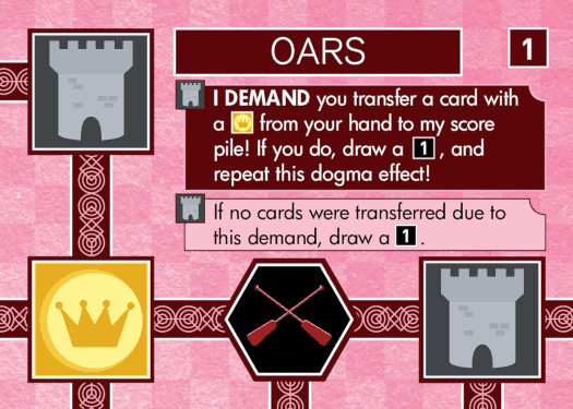
I think the cards were already close to illegible beforehand, and I think the main reason is that they are way smaller than they need to be.
My implementation on a site that I'm probably not allowed to name here (due to BGA's ridiculous TOS) uses 3rd edition graphics as well, and they are perfectly readable there.
Re: Old Graphics are better than the original
Posted: 14 July 2022, 17:55
by Sloth-DMV
What really is so hard about just setting the existing BGA game to "Innovation (core game)", and simply creating/forking a separate BGA game "Innovation (expansions)"?

That way the bulk of us who LOVE playing this the way it was before this week can continue to do so,
AND those who want to play with the expansions (and work through whatever growing pains) can do that?
Win-win.
Re: Old Graphics are better than the original
Posted: 14 July 2022, 19:16
by Claus82
I would second the option for players to select the old design (which was much better). I stopped playing Innovation yesterday because of the change.
Re: Old Graphics are better than the original
Posted: 14 July 2022, 20:48
by scoll31
Re: Old Graphics are better than the original
Posted: 14 July 2022, 20:52
by scoll31
Qui doit-on remercier pour ces magnifiques graphiques ? .....
