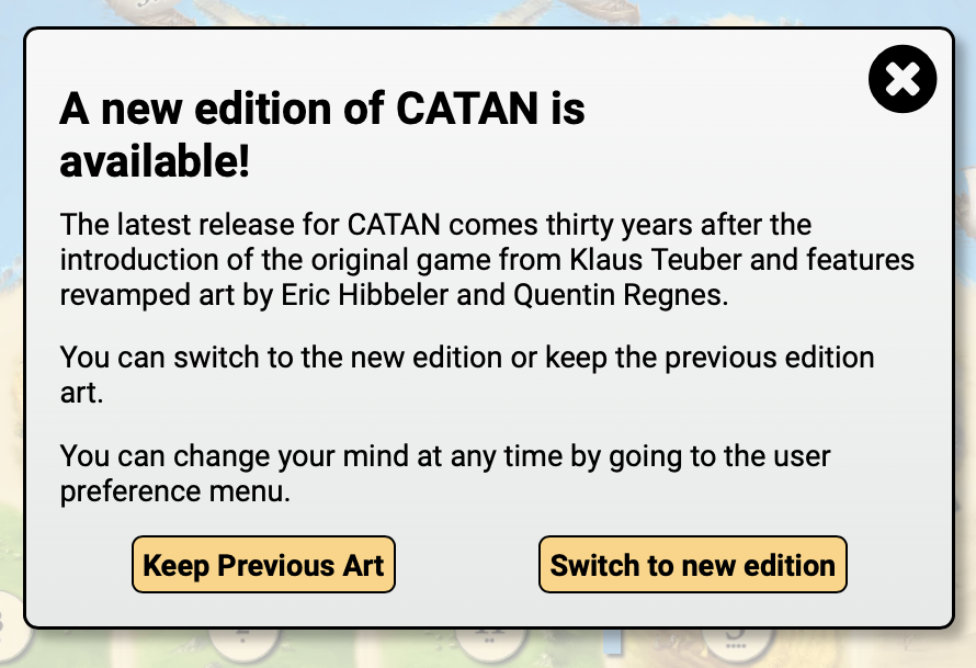
new graphics

Forum rules
Please DO NOT POST BUGS on this forum. Please report (and vote) bugs on : https://boardgamearena.com/bugs
User avatar
marktempeit
Posts: 4
Joined: 18 March 2021, 15:51

Re: new graphics

Post by marktempeit »

Liking it or not, it's a matter of taste. Also, I own a copy with the previous design and I have been playing for years so it's natural that it feels uncomfortable. I also understand that if there is a new owner of this game rights, they want the game here to match what they sell.
STILL... if I did not know the game by heart, I don't think I would be able to parse what is written on the cards. The quality of the pictures is very low (compare it to how neat the interface looks like). Constantly using the tooltip to understand what a technology is, is not welcoming new players. So if anyone is trying this game here before buying... they won't buy it.
  1. At least make a readable version, please.
  2. At best, keep this as default, if you need to, but kindly give those who played for years (and started subscribing to BGA because of Yokohama: me) an option to use the previous one.
JohnnyCyclops
Posts: 282
Joined: 05 July 2023, 22:06

Re: new graphics

Post by JohnnyCyclops »

DanseMaccabre wrote: 26 June 2025, 12:20 It's weird having meeple sized holes and then cubes in them...
They are meeples in the live game. I think they were meeples here initially and quickly changed to cubes because the meeples didn’t stand out sufficiently against presidents that are only a little larger.

My only grumble with the live game is the assistant meeples seem really tiny, although if they were cubes would be no smaller than cubes in other games (e.g. Wingspan). Photos deceived me as to scale.
User avatar
Steeves
Posts: 1
Joined: 29 April 2020, 00:57

Re: new graphics

Post by Steeves »

I'm not one to belly-ache. I usually roll with the punches and accept changes to games as part of progress. I live with it. I deal with it. I move on. But this is different.

Yokohama's graphic changes are atrocious. The colors of the meeples are harder to tell apart. My current game has me as "soft purple" and I'm getting mixed up with my opponent who is "magenta." The landing cards aren't intuitive, and the game just doesn't look as interesting or fun.

The only thing I actually like is the new country flags. I used to have a rough time telling Germany and the US apart without my glasses, but these new symbols are clear as day.

I'm just one guy, but I've been on BGA for over five years and playing Yokohama for at least that long. I want the old version back.
User avatar
marktempeit
Posts: 4
Joined: 18 March 2021, 15:51

Re: new graphics

Post by marktempeit »

Apologies for my second post, but this is how it is supposed to be done:

Image
Markelix
Posts: 6
Joined: 26 April 2025, 09:19

Re: new graphics

Post by Markelix »

Switched to the new version - and immediatly back to the "Previous Edition".
Sorry, but especially the buildings in the new version looks ugly (no shadows) and the landscape looks different but not better... just different.
Last edited by Markelix on 04 July 2025, 10:42, edited 1 time in total.
Markelix
Posts: 6
Joined: 26 April 2025, 09:19

Re: new graphics

Post by Markelix »

Jedirockard wrote: 15 June 2025, 23:33 Had to abandon the turn-based game we were playing that had switched to the new graphics mid-game as the new version was so bad. The Power 5 bonus TWICE gave me 1x Import when it had been showing 3x Fish, so that is just a complete error. The colours and layout is awful compared to the previous version and the distinction between the President and Assistants is impossible to discern without big magnification. Quite simply, this new version is now unplayable and I for one will never be playing it again while it is so poor.
you can switch back in the game options
User avatar
DanseMaccabre
Posts: 6
Joined: 28 February 2024, 18:17

Re: new graphics

Post by DanseMaccabre »

Yes, that wasn't available at the time.
User avatar
BB8R2D2
Posts: 3
Joined: 20 July 2022, 09:18

Re: new graphics

Post by BB8R2D2 »

I switched to the new look and immediately switched back again too, I realize that it's trying to be like the rl game but the knights were really awkward to figure out what was what and personally I just prefer the old art
User avatar
Darknova
Posts: 2
Joined: 17 April 2020, 15:57

Re: new graphics

Post by Darknova »

Please bring back (al least an option for) the old graphics.
The new style is unclear..
JohnnyCyclops
Posts: 282
Joined: 05 July 2023, 22:06

Re: new graphics

Post by JohnnyCyclops »

Markelix wrote: 03 July 2025, 11:43
Jedirockard wrote: 15 June 2025, 23:33 Had to abandon the turn-based game we were playing that had switched to the new graphics mid-game as the new version was so bad. The Power 5 bonus TWICE gave me 1x Import when it had been showing 3x Fish, so that is just a complete error. The colours and layout is awful compared to the previous version and the distinction between the President and Assistants is impossible to discern without big magnification. Quite simply, this new version is now unplayable and I for one will never be playing it again while it is so poor.
you can switch back in the game options

Do you mean switch back in Yokohama? You and other posters are not being clear. If it is Yokohama then where is the toggle switch found for old/ current formats?
Post Reply

Return to “Yokohama”