Not a bug, but need better screen layout options, please!

Forum rules
Please DO NOT POST BUGS on this forum. Please report (and vote) bugs on : https://boardgamearena.com/bugs
User avatar
blhootz
Posts: 25
Joined: 12 February 2012, 08:42

Not a bug, but need better screen layout options, please!

Post by blhootz »

Hi there! I just played (and won!) my very first game of Space Base. It was everything that I hoped it would be. In theory, this game ticks just about all of the boxes as the ideal game for my particular game group, and I want it to be a big hit with them. There's just one problem...

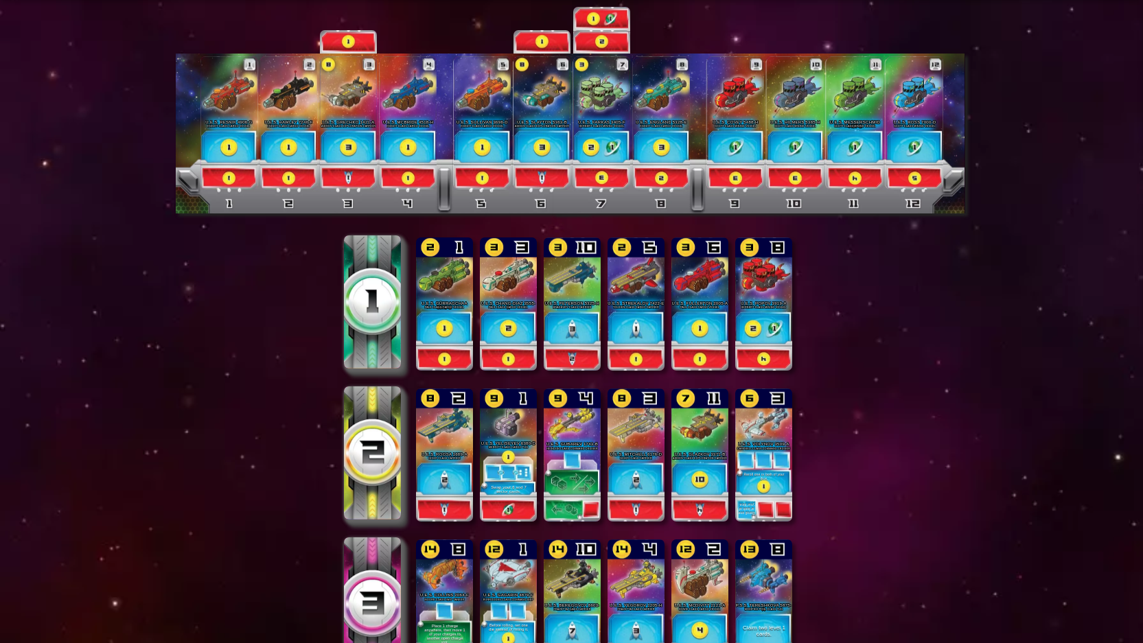
I don't mind having to scroll down in order to see other people's player boards, but in order to fit all of the available cards and my own player board on screen together at the same time, I need to zoom out quite a lot, which makes the cards fairly unreadable. Even just the card costs and which slot they go in are difficult to discern when zoomed out that much. What's especially disappointing is that this is going to make it problematic for me to even *teach* the game to my group, which has some elderly folks in it, let alone for them to play it easily. Heck, my slowly-aging eyes still aren't all that bad, myself, but I don't want to have to squint or scroll or zoom in or hover over each and every card all the time just to see and know what they are. And I don't think my family is going to have the patience for doing any of that, themselves.

Unfortunately, I just can't picture my family easily playing this otherwise fantastic and nearly perfect game for them with its current screen layout. So what I'm asking is whether there might be a way to implement an optional, different layout for all the essential game elements that optimizes the screen area better? I know there are a lot of cards out on the table to keep track of, but boy, it'd sure be great to be able to see them all at once, plus my player board, without having to make them so gosh darn small.

I know other games, like Thurn & Taxis, and Hanabi, have multiple screen layout options, so I thought I'd ask. Thanks for your consideration. :-)
User avatar
fruktansvärt
Posts: 181
Joined: 18 September 2020, 19:16

Re: Not a bug, but need better screen layout options, please!

Post by fruktansvärt »

I would be interested to see what other ideas for layout people could come up with.

Obviously, the biggest culprit in wasted screen real estate is the picture of the ship on each card. Removing that would halve the size of the card with no information loss. But it wouldn't look as nice, and I wouldn't be surprised if the publisher nixes that idea.
pjt33
Posts: 210
Joined: 05 April 2020, 15:35

Re: Not a bug, but need better screen layout options, please!

Post by pjt33 »

fruktansvärt wrote: 15 April 2022, 13:34 Obviously, the biggest culprit in wasted screen real estate is the picture of the ship on each card. Removing that would halve the size of the card with no information loss. But it wouldn't look as nice, and I wouldn't be surprised if the publisher nixes that idea.
It's not a bad suggestion, though, if blhootz reckons that their group would be able to cope with using custom CSS. The tricky thing would be that the animations (and in particular the placement of white cubes) might use hard-coded values in JavaScript and not be modifiable with CSS.
User avatar
blhootz
Posts: 25
Joined: 12 February 2012, 08:42

Re: Not a bug, but need better screen layout options, please!

Post by blhootz »

pjt33 wrote: 15 April 2022, 16:37
fruktansvärt wrote: 15 April 2022, 13:34 Obviously, the biggest culprit in wasted screen real estate is the picture of the ship on each card. Removing that would halve the size of the card with no information loss. But it wouldn't look as nice, and I wouldn't be surprised if the publisher nixes that idea.
It's not a bad suggestion, though, if blhootz reckons that their group would be able to cope with using custom CSS. The tricky thing would be that the animations (and in particular the placement of white cubes) might use hard-coded values in JavaScript and not be modifiable with CSS.
Thanks for chiming in. Interestingly, removing the middle of the cards with the picture of the ship was the very first thing that I had thought of, myself, in order to tighten up all the important info on the screen. But I didn't mention it in my original post because 1) I didn't want my initial post to get too much longer; and 2) I, too, felt like it was the sort of change that the publisher probably wouldn't go for. But I'm so glad you brought it up, because that does seem like one halfway decent solution to the problem at hand.

(I'm also not sure at all how one implements a custom CSS thing. But even if this winds up being the best solution at hand, it still doesn't solve the problem for new players around the world who encounter the game for the first time and encounter the same frustrations I had right out of the gate. Having a true, sanctioned, and implemented layout variant would be more ideal in the long run, imho.)
fruktansvärt wrote: 15 April 2022, 13:34 I would be interested to see what other ideas for layout people could come up with.
I think it'd be great if we collectively brainstorm some other potential layout options. I'm going to have to play the game a few more times, myself, and take a bunch of screen shots and all. I'm sure that with everyone's minds pooled together, a reasonable alternative could be found. Thanks!
pjt33
Posts: 210
Joined: 05 April 2020, 15:35

Re: Not a bug, but need better screen layout options, please!

Post by pjt33 »

blhootz wrote: 15 April 2022, 19:22 (But even if this winds up being the best solution at hand, it still doesn't solve the problem for new players around the world who encounter the game for the first time and encounter the same frustrations I had right out of the gate. Having a true, sanctioned, and implemented layout variant would be more ideal in the long run, imho.)
True. I think the problem is that there's too much information. I dislike playing it on a tablet because a single row is too wide for the screen.

Thinking about it, the specific problem that you mention about reading costs and slots when zoomed out is probably feasible with custom CSS. I might find time to play with that this weekend.
User avatar
Meeplelowda
Posts: 1240
Joined: 14 March 2020, 10:31

Re: Not a bug, but need better screen layout options, please!

Post by Meeplelowda »

The only reason I can comfortably see all the cards at once (except the opponents' cards) is that I play on a 24" monitor.

But bigger cards won't solve my problem that at least once per game I look at a card's cost and expect it to go into that sector! :lol:
User avatar
blhootz
Posts: 25
Joined: 12 February 2012, 08:42

Re: Not a bug, but need better screen layout options, please!

Post by blhootz »

Meeplelowda wrote: 16 April 2022, 00:22 But bigger cards won't solve my problem that at least once per game I look at a card's cost and expect it to go into that sector! :lol:
Ha ha, yeah, I get it.

So I started up a new game so I could see all the elements again. I'm on a 14x10 ratio monitor, so I've even got a little extra height than probably many people, and I'm still missing so much.

Anyway, without mocking it up, one alternate layout idea came to mind pretty quickly. I'm thinking that there (hopefully) is room for three rows of cards to sit comfortably on one's screen without having to zoom out a ton. If so, then what if your player board were on the left-hand side in three rows: slots 1-4, 5-8, and 9-12. Next to that in the middle part of the screen would be the available ship cards: levels 1, 2, & 3 in their distinct rows. And then on the far right would be three rows of 4 cards each for the colony cards.

It's not necessarily the "prettiest" way to set it all up, but I think it probably would fit the dimensions of most regular screens better than what we've got right now.

Thoughts?
pjt33
Posts: 210
Joined: 05 April 2020, 15:35

Re: Not a bug, but need better screen layout options, please!

Post by pjt33 »

As implied in my previous comments, I personally wouldn't choose to use any layout which splits rows.

If you want to try out my enlarged cost-and-slot headers (only on cards which are available to buy, not on acquired cards), add the following to your custom CSS:

Code: Select all

@import url(https://pjt33.github.io/bga_custom_css/space_base.css);
(You have to go to https://boardgamearena.com/preferences?section=advanced and paste that into the text box, then save. Then refresh the page to get it to work. If you don't like it, you can delete it again in the same way).
User avatar
fruktansvärt
Posts: 181
Joined: 18 September 2020, 19:16

Re: Not a bug, but need better screen layout options, please!

Post by fruktansvärt »

pjt33 wrote: 19 April 2022, 00:01 If you want to try out my enlarged cost-and-slot headers (only on cards which are available to buy, not on acquired cards), add the following to your custom CSS:
Could you share some screenshots?
pjt33
Posts: 210
Joined: 05 April 2020, 15:35

Re: Not a bug, but need better screen layout options, please!

Post by pjt33 »

fruktansvärt wrote: 19 April 2022, 10:19 Could you share some screenshots?
Image
Post Reply

Return to “Space Base”