Page 1 of 4
New chat & notification system
Posted: 23 September 2014, 17:40
by sourisdudesert
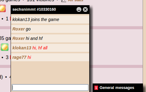
We are experimenting today a new chat/notification system on BGA main website.
Until now, chat messages from different sources were mixed up at the bottom left of BGA. With this new system, each conversation gets its own dedicated space. Discussion history is also displayed from top to bottom - which is more logical.
If this is satisfying, we may use this system also into the games in order to make a clear separation between the chat messages and the history logs.
Don't hesitate to give us your feedback about this system.
UPDATE: following your feedback, the new system has been updated:
- General messages are now back to the bottom left space.
- Size of the chat windows has been reduced.
Re: New chat & notification system
Posted: 23 September 2014, 17:59
by Tejo
Sorry to be the first to post and to post a critic, but honestly I did prefer a lot the old system.
IMHO it was clearer before, the informations (and the space to write) about the general and private/table chats on the left under the tabs "news" "play now" and so on, and well divided by the main screen with the tables on the centre/right without any chance of confusion.
Now the left space about the 6 tabs it's unused, or better: you use it to start a chat that after the beginning moves in another portion of the screen. And the chats will constantly open on the main screen (covering the tables), they appear only for one second if you don't expand any single chat, hiding more part of the main screen... it seemed a lot more confortable and understandable as it was before.
Re: New chat & notification system
Posted: 23 September 2014, 18:06
by squarerootofthree
I know there are a lot of people who dislike the new chat (someone even went so far as to claim they were quitting BGA entirely because of the new chat


).
I personally really like it. It's easier to see a past chat history. Having separate chats grouped into their own categories makes sense to me.
Re: New chat & notification system
Posted: 23 September 2014, 18:13
by sourisdudesert
Hi,
I forget to mention that we also did this to re-use the space left below the menu for another purpose. At now you still have to start your conversation from there but this will be improved afterwards.
Thanks for your feedback.
Re: New chat & notification system
Posted: 23 September 2014, 21:08
by Piccettino
Do not like. I always have to open that box to just see what people are saying while previously it was directly in the "chat log" and you could see it immediately.
Re: New chat & notification system
Posted: 23 September 2014, 22:52
by cailindeas
I do not like it at all; the chat system on the left was out of the way and easy to ignore. The new system is not - and it doesn't add anything.
Re: New chat & notification system
Posted: 23 September 2014, 23:13
by jatubio
Hi, i think that all the changes are good and i understand that for lot of people can be hard to accept changes (for me too)

Maybe can put one setting checkbox in preferences to select what chat prefer to use: new or old.
A good mixed solution can be show the news chat boxes into left column.
Thanks for your time and invested in improving our user experience effort.
Re: New chat & notification system
Posted: 24 September 2014, 05:23
by bmrr
Don't care for it as the new chat boxes are very prominent (all black) and annoying and you have to keep on turning them off. with the chat windows at the left you don't have to worry about them and can easily ignore them if you wish.
Re: New chat & notification system
Posted: 24 September 2014, 07:20
by senatorhung
i prefer the previous chat and message interface. i have other browser apps which use the bottom menu bar of the browser and the chat boxes are easily confused with those. i do like separating out the chat from different sources, but those could just be in separate boxes on the left side (general chat, current table chat).
Re: New chat & notification system
Posted: 24 September 2014, 08:40
by ryoga121
Don´t like....