The play area of the UI should be resizable/expandable/modifiable. Right now, a huge amount of screen real estate is being wasted on information that is irrelevant to the game at hand and is likely not stuff that most people care about, most of the time. The result is a constrained, claustrophobic feeling when playing the game, and having to inanely scroll around the playfield when it expands beyond the current play window.
Here's an example from Hive:
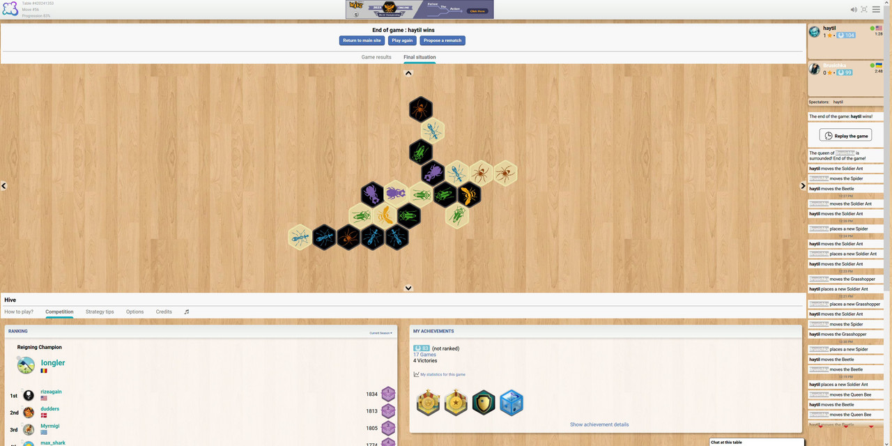
Luckily, the game mostly expanded horizontally, so everything fit on the screen. But had it expanded or moved vertically - as it often does - I'd have to constantly scroll up and down to see the whole playfield. Not being able to see everything at once increases the likelihood of making a strategic mistake. It's also annoying.
Looking at the screenshot, we can see what compensation the player receives in exchange for this annoyance. 40% of the vertical screen real estate has been devoted to:
A) Seeing the game's current leaderboard
B) Seeing the current achievements
C) A variety of menu options, including "How to play?", "Strategy Tips," and "Credits."
Neither option A or B are at all relevant to the current game in progress - and most players interested in that information are going to be interested rarely enough that simply having to scroll down to see it isn't going to be a major inconvenience.
Likewise for option C. Most players only really need to check the rules a few times, for instance. Not every time they play, and again, there's no reason that having to scroll down for it would be an issue (though in all fairness, option C takes up the least real estate and isn't the major offender here).
Zooming in and out via the browser has little, if any, effect on this issue. (And frankly, even if it did, zooming out wouldn't be an adequate solution - there's no reason the tiles should be made smaller, and harder to see, just to fit a bunch of other irrelevant information on the screen).
So there should be a way to expand the actual game board's screen real estate (or minimize/hide the leaderboard and achievement panels).
Here's an example from Hive:
Luckily, the game mostly expanded horizontally, so everything fit on the screen. But had it expanded or moved vertically - as it often does - I'd have to constantly scroll up and down to see the whole playfield. Not being able to see everything at once increases the likelihood of making a strategic mistake. It's also annoying.
Looking at the screenshot, we can see what compensation the player receives in exchange for this annoyance. 40% of the vertical screen real estate has been devoted to:
A) Seeing the game's current leaderboard
B) Seeing the current achievements
C) A variety of menu options, including "How to play?", "Strategy Tips," and "Credits."
Neither option A or B are at all relevant to the current game in progress - and most players interested in that information are going to be interested rarely enough that simply having to scroll down to see it isn't going to be a major inconvenience.
Likewise for option C. Most players only really need to check the rules a few times, for instance. Not every time they play, and again, there's no reason that having to scroll down for it would be an issue (though in all fairness, option C takes up the least real estate and isn't the major offender here).
Zooming in and out via the browser has little, if any, effect on this issue. (And frankly, even if it did, zooming out wouldn't be an adequate solution - there's no reason the tiles should be made smaller, and harder to see, just to fit a bunch of other irrelevant information on the screen).
So there should be a way to expand the actual game board's screen real estate (or minimize/hide the leaderboard and achievement panels).
