
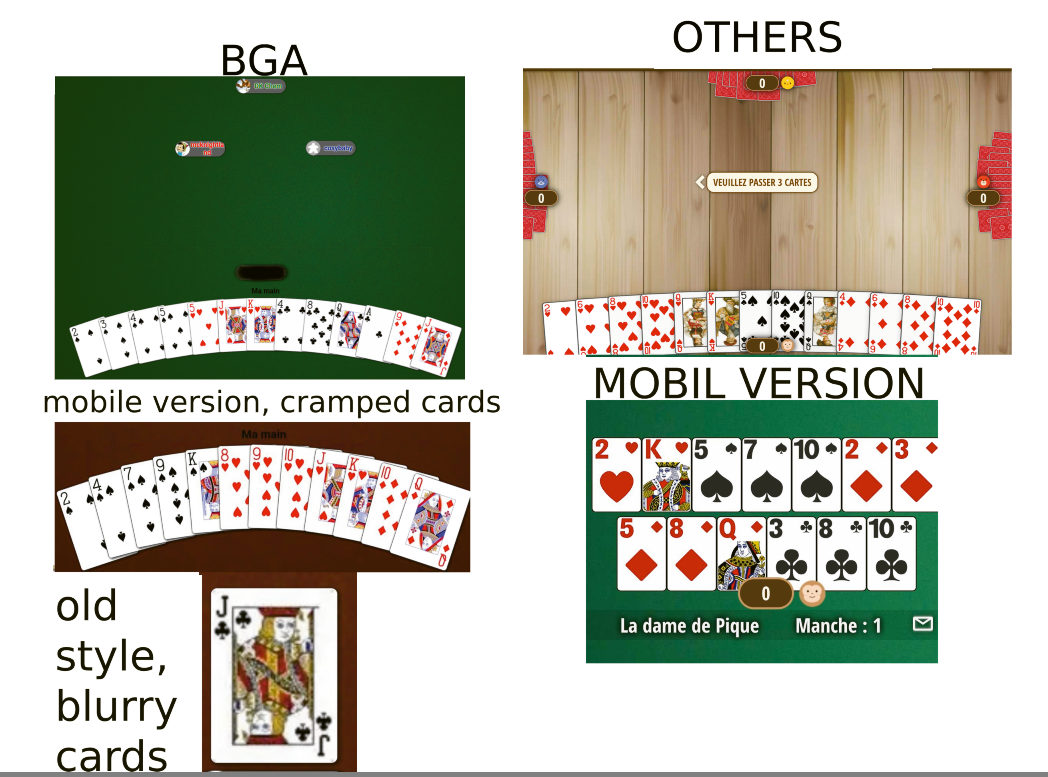
This new update feels very old-fashioned. The cards on the mobile version are very cramped when using the default layout, which could quickly lead to mistakes when selecting cards, in my opinion.
This default choice could therefore, in my opinion, drive more than a few users away, since many people play on their phones, and not everyone thinks to go into the settings to make adjustments.
It only took me clicking on the first Google result for this game to notice how modern other sites look. Even if they’re not perfect, they’re still clearly more appealing.
When trying to choose the card style I prefer, they appear very blurry, even though they were perfectly sharp in the previous version (same style).
Anyway, I suppose it’s a matter of getting used to it (except for the blurry cards). Offering three background colors is a nice idea, but why not include a light color like before? Right now we only have three very dark options
Thanks nonetheless for the effort put into this update.
This default choice could therefore, in my opinion, drive more than a few users away, since many people play on their phones, and not everyone thinks to go into the settings to make adjustments.
It only took me clicking on the first Google result for this game to notice how modern other sites look. Even if they’re not perfect, they’re still clearly more appealing.
When trying to choose the card style I prefer, they appear very blurry, even though they were perfectly sharp in the previous version (same style).
Anyway, I suppose it’s a matter of getting used to it (except for the blurry cards). Offering three background colors is a nice idea, but why not include a light color like before? Right now we only have three very dark options
Thanks nonetheless for the effort put into this update.


