Hanabi: grand feux (new edition)

Forum rules
Please DO NOT POST BUGS on this forum. Please report (and vote) bugs on : https://boardgamearena.com/#!bugs
Locked
MissCurious
Posts: 1
Joined: 27 September 2020, 16:33

Re: Hanabi: grand feux (new edition)

Post by MissCurious »

Please HELP... I play this game daily and the new interface borders on unusable. Where is the option to go back to the old style?

This new thing we have now is ugly, clunky and the hands are reversed when looking at other players (their left is your right etc). Totally ruining the game and this website... cancel Premium anyone? :(

Edit: I've also tried a lot of different display options on PC (inc full screen and scaling the browser) but cannot get both players hands to be visible at the same time, one is always cut off.
Last edited by MissCurious on 05 November 2020, 14:18, edited 2 times in total.
User avatar
Remycad
Posts: 17
Joined: 04 April 2020, 18:17

Re: Hanabi: grand feux (new edition)

Post by Remycad »

I also have an issue with the display.
I'm in a 2 player game with 6 cards/player, avalanche and black powder on (might happen in other configurations too ?) and my leftmost card is always hanging over the black column in the play arena. And almost everytime I try to select the left card, it instantly plays it...
Edit : also playing with flamboyant option, when I put a card back in deck, it still appears in the discard zone...
Edit 2 : already mentionned but where is the mistakes count ? no bombs anymore ?
Last edited by Remycad on 05 November 2020, 14:25, edited 1 time in total.
User avatar
01oigres
Posts: 1
Joined: 01 May 2020, 16:36

Re: Hanabi: grand feux (new edition)

Post by 01oigres »

I have been trying out the new interface and gamemodes and here is my feedback:
  • First of all, to people who are saying is horrible, you are just not used to it. It is much more beautiful and you just need to get used to it. After playing a couple of games I think it is fine.
  • In my opinion, there should be a more intuitive way to show the mistakes made (bombs). I played a couple of games and asked a bunch of people where were they displayed and none had an answer. After reading the article, I think it is a nice addition the way it is displayed, but I don't think reading this instructions has to be the only way to notice it. Therefore I believe that something else more visual should be added.
  • Regarding the new gamemodes, got to say they are pretty fun.
  • Don't know if it is a bug, but playing normal mode + black powder we managed to get max score (was a bit hard) but we got 0 elo. I don't know if this is intended (maybe it is very lightly weighted) but found it weird
  • I've seen that people already pointed it out but zooming out in order to make everything fit better with ctr - has almost no effect. Playing ground is the same size but things look more little. If you want the game to occupy part of the screen i believe there is no way to do it
Thanks and keep up with the good work :D
User avatar
Travis Hall
Posts: 213
Joined: 12 April 2020, 14:13

Re: Hanabi: grand feux (new edition)

Post by Travis Hall »

sourisdudesert wrote: 05 November 2020, 10:57 Except that 95% of the time you are giving one of the 2 proposed clues.
Old interface: 2 clicks at opposite sides of the screen. New interface: 2 clicks really closed, same side of the screen => faster.
In the interests of constructive feedback...

I can see why you’ve changed how clues are given. It does more closely conform to how players explore the game when first learning, especially when doing so with the physical game. At the same time, I can also see the point that has been made that players have to read the popup menus quite carefully when giving clues now.

So, perhaps this could be improved with a preference, similar to the “stacked” vs “table” layout preference. Call it “terse clues” vs “verbose clues”, or whatever substitute you think is more understandable to the user base.

Verbose clues is basically what you have now. (Maybe experiment with fonts and contrast and such, but the wording would be basically the same.)

Terse clues replaces most of the text. For a number clue, the option simply becomes the relevant number (but use a larger font - with only one character, not only will that help with legibility, it also increases click target area.) For a colour clue, the option becomes the new icons you have associated with the colours, but rendered in the relevant colour. That way your popup menu becomes two simple options, plus “more” to get to negative clues, the full list of colours for multi, and such.

That gives you full text for those who need it to help them explore the game, and an easier-to-see preference for those who are trying to speed up their play or for whom a translation in their language isn’t ready yet.
User avatar
Khoo1
Posts: 72
Joined: 20 October 2016, 13:21

Re: Hanabi: grand feux (new edition)

Post by Khoo1 »

sourisdudesert wrote: 05 November 2020, 08:52 Dear Hanabi players,
We are very proud to introduce the new edition of Hanabi: "Grand Feux", on Board Game Arena.
Thank you.
7 pages of Hanabi players in forum are not proud of the new edition on Board Game Arena. :lol:
sourisdudesert wrote: 05 November 2020, 08:52 Hanabi Grand Feux is a brand new edition of Hanabi, with a new design and 3 integrated expansions: Avalanche of colors (multicolored cards), Black Powder (10 black cards) and 5 flamboyants (6 bonus tiles).

Yahoo!
Thank you for the expansion packs. 8-)
sourisdudesert wrote: 05 November 2020, 08:52 Almost 400 of you tested this new version during the past months: thanks a lof for your great feedback! Today, as announced on last month, the update is available for everyone :)

Could you ask DrClinic to enable on my account to red thumbs 400 testers.
You can even cancel away those old red thumbs I used because these testers... really got on 7 pages of Hanabi players' nerves :mrgreen:
sourisdudesert wrote: 05 November 2020, 08:52 So, what's new?

New expansion: Flamboyant
This expansion introduced 6 "Flamboyant" tiles, each with a special effect.
When you complete a color (placing a 5), instead of getting a free extra clue, you pick one of these tiles and apply its effect.
The list of effects are:
_ remove an error + get a free cue
_ give (for free) a color clue
_ give (for free) a value clue
_ choose a discarded card and place it back into the deck
_ choose a discarded card that can be played and play it immediately
_ get a free clue

Where is the flamboyant power / effect to right size the game back into 1 view size so that players do not have to keep scrolling all over to find information they need? :geek:
sourisdudesert wrote: 05 November 2020, 08:52 New expansion: Black Powder
This expansion introduce 10 new "black" cards (1 "one", 2 "two", 2 "three", 2 "four", 3 "five"), which is a 6th firework.
3 special rules for black cards:
_ you can't give a "color" clue to a black card.
_ the firework must be played from 5 to 1 instead of 1 to 5.
_ at the end of the game, each missing black card remove 1 point from your score.

This new version has multicolour on purple in a dark blue background.
400 testers did not feedback this low contrast difficult to view? Really? :oops:
sourisdudesert wrote: 05 November 2020, 08:52 New option: Convention used
With this new option, you can display to other players the Hanabi convention that is used for your game, before they joined (ex: "Finesse").
This way, you are sure that everyone know the convention used for the game before starting it.

The real game in a box has such feature? Really?
BGA can introduce such feature for player's setting but not the 1 thing 7 pages of players are asking for?
A zoom function in stacked mode to fit the game into 1 screen view without poor contrast. Players want to see properly. Please help.

It is nice there is no dialogue box appearing when cursor hovers over a card to show the same information that is displaying on a clued card. Thank you. :)
sourisdudesert wrote: 05 November 2020, 08:52 New interface
The interface has been totally upgraded.

After:
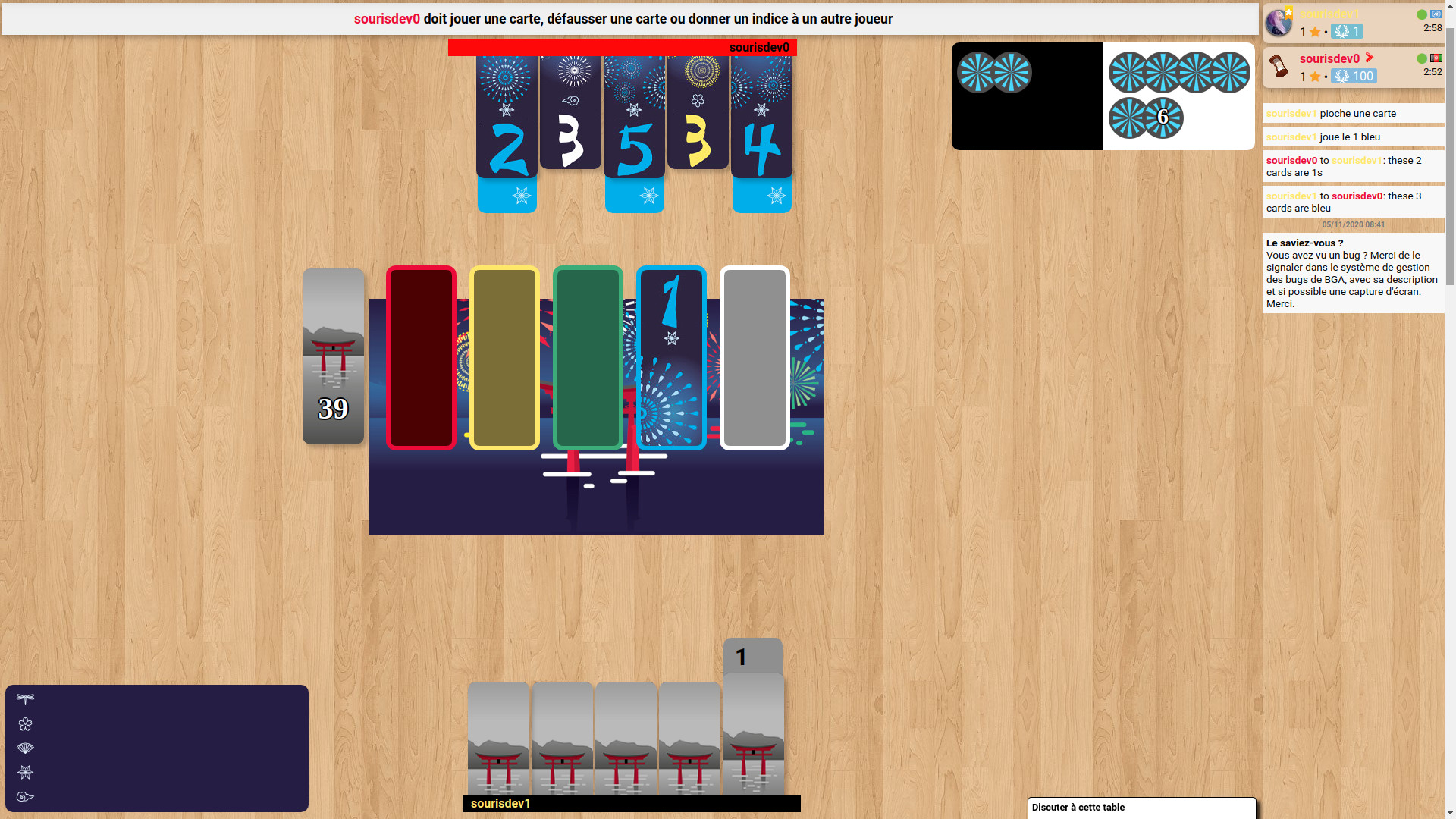
Image
400 testers and BGA game designers can really see player's name in yellow on the default BGA background? Really? ....refer to image.
If 400 testers do not respect players to know their identity, can they be cooperative? ...400 red thumbs, please. :lol:
sourisdudesert wrote: 05 November 2020, 08:52 The main changes are:

1.
Cards are way bigger and easier to read.

2.
To give a clue, you now start by choosing a card. On the previous interface, you were forced to choose a clue first, which was counter-intuitive and disturbing for new players. We know that it is a difficult change if you are used to the previous version, but after few games you'll find it very handy :)

3.
By default, the players are now displayed around the table.
This is how the original game is, and has a lot of advantage: your hand is at the bottom, like at a real table, and it makes the turns way more easy to understand.

Now, we totally understand that some of you are used with the "stacked" version, so the good news is: we made a preference to get back to the previous layout :)
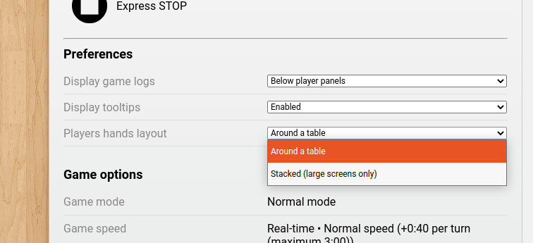
Image

Using this preference, the overall layout will be almost the same than in the previous version.

4.
The mistakes are now displayed at the center: the board behind the fireworks is becoming red when mistakes are made:
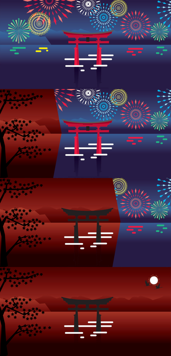
Image


1. Yes, the cards are way bigger... but too big. See 7 pages of feedback in <1 day.
I do not speak for all players. These cards are mot easy to read for me. :roll:

Why would 400 testers approve of BIG card face without useful information, I will.... ask for a function like that convention setting to filter those 400 testers. Could you please? :D

2. This is more intuitive for new players.
Why BGA cannot have both system of interface? This present one, click card first and to most popular one, click token first ?
It is a SOFTWARE. :idea:

3. Round table feels real but why stop there? Why not place their faces there too? ...what I am trying to say is, the card visuals are too big.

So great BGA can TOTALLY UNDERSTAND some of YOU. Yipee. 7 pages of feedback in forum > 400 testers.
So can BGA please .... UNDERSTAND the majority and have an option to OPTIMIZE the design and interface ? :P

4. Cool ... but real Hanabi in box do not do this.
We do not need to see 6 tokens that cannot be used. Players prefer to see the RED tokens when incurred.

On top of this, can NEW players really notice that background changing? .... when they cannot even notice where to click. :lol:
sourisdudesert wrote: 05 November 2020, 08:52 We know that it is really hard to change habits, but the previous version of Hanabi adaptation was really ugly and had some interface problems that has to be solved.

You know it is really hard to change habits then why force the change on players?
Hanabi players are mostly COOPERATIVE but your game designers are FORCING players to a NEW UGLY (according to 7 pages of feedback in forum) and new interface that cannot be interchangeable with the most popular interface? Really? :roll:

7 pages of feedback is saying the "SOLVED" - just caused new problems. :oops:
sourisdudesert wrote: 05 November 2020, 08:52 Of course, this new adaptation will continue to progress in the following days/week, so please don't hesitate to post your improvements ideas here.

Thanks for making Hanabi such a big success on BGA!

Will BGA listen to 7 pages of feedback? :?

Thank you Sourisdudesert and help us enjoy more Hanabi on BGA! :D
User avatar
cb248
Posts: 1
Joined: 17 March 2020, 23:50

Re: Hanabi: grand feux (new edition)

Post by cb248 »

The new version is absolutely disastrous. It sucks all the fun out of playing, because you are preoccupied with understanding the interface rather than calculating efficient Hanabi moves such as finesse, bluff and reverse. Each players' "oldest" and "newest" cards are in a different location, making it very very difficult to identify patterns at first glance and to be aware of looming discards. We all absolutely hated the game and I am inclined to stop playing on boardgamesarena completely and migrate over to Hanabi.live, as this version is completely and utterly unplayable. I will now try changing the preference settings, as you proposed, but if that is not almost identical to the old version, you've lost me. Absolutely baffles me, how this version could pass the beta testing. Literally no improvements over the older version, and only made it worse!
User avatar
apotap
Posts: 19
Joined: 24 June 2020, 19:29

Re: Hanabi: grand feux (new edition)

Post by apotap »

Feel as returned home and see that somebody rearranged all furniture, threw away my favorite slippers and place a pair of traditional Japanese "geta" instead. And big announcement - "We are proud to say that your house is much better now!". But where should I go now? :(
User avatar
JustKickinIt
Posts: 1
Joined: 05 November 2020, 07:44

Re: Hanabi: grand feux (new edition)

Post by JustKickinIt »

UNPLAYABLE!!!!!!!!!!!
User avatar
Eli2
Posts: 2
Joined: 05 November 2020, 14:28

Re: Hanabi: grand feux (new edition)

Post by Eli2 »

Entiendo que la intención ha sido la de mejorar hanabi, pero no se ha conseguido. Los nuevos cambios cuando se colocan las cartas de 5 suenan interesantes, poco más positivo puedo decir. Es cierto que los cambios cuestan un poco, pero ¿realmente eran necesarios en un juego como el hanabi? Este juego es lo que es, números, colores y pistas. Ha dejado de ser intuitivo, de hecho, es hasta molesto. Los colores son feos y pastelosos, las fichas de pista utilizadas molestan, los continuos desplazamientos en la pantalla para poder ver todo lo necesario dificultan el juego, las cartas descartadas no llaman la atención y tienes que desplazarte en la pantalla continuamente, la manera de dar pistas a otros jugadores es molesta, las cartas son estrechas.

La disposición de los jugadores alrededor de la mesa tiene su gracia, pero no es práctico. Es cierto que de manera presencial se juega así, pero estamos jugando online, dificultarlo porque sea más gracioso no parece que tenga mucho sentido. Me dio la impresión de que cuando cambié la disposición en opciones mis fichas seguían estando a parte, aunque agrupaba las de mis compañeros, he preferido no jugar una segunda partida para comprobarlo porque ha sido horrible. Pido disculpas si estoy equivocado en este punto, pero realmente me ha molestado tanto jugar la partida que he preferido no jugar otra.

Pese a todo quiero dar las gracias por todo el trabajo que hay detrás del hanabi en Board Game Arena, esto es solo mi opinión sobre los cambios.
User avatar
squirrel1988
Posts: 3
Joined: 30 May 2020, 16:37

Re: Hanabi: grand feux (new edition)

Post by squirrel1988 »

Could we PLEASE have the old setting back to Hanabi?

This new setting looks fancy and all but it is VERY inefficient especially with giving clues which is the most important factor in this game.
Also I had issues with playing a card and the cards were discarded instead.

The new setting also requires us to have a bigger screen and the board does not fit into the screen. It is already VERY hard on laptops, so I cannot imagine playing hanabi on the phone for mobile users.

PLEASE PLEASE PLEASE bring the old setting back for us the regular hanabi players.

I know that a lot of regular players will not play anymore because of this. I am a regular player of this amazing game, and decided to be a premium member because of it, and right now i am not sure anymore since my go-to is a complete mess.

I am sure you guys are already aware of the fact that A LOT less players are playing the game.
We gave it a try, and it is really not enjoyable at all.

Thank you for hearing me out.
Locked

Return to “Hanabi”