Give us back 7 Wonders

Forum rules
Please DO NOT POST BUGS on this forum. Please report (and vote) bugs on : https://boardgamearena.com/#!bugs
MarioMinaccia
Posts: 5
Joined: 15 April 2020, 12:18

Give us back 7 Wonders

Post by MarioMinaccia »

This is a petition to ask nicely to have back 7 Wonders, ihmo the best game ever made.

The new version is, in my opinion, inferior to the previous one, from the gameplay (the most important issue) to the graphics (one can get used to it, but still: why make things harder?).

I would like to see something done about it: my proposal is to implement something like bga did for "Through the Ages", in which the "new" version was simply added as a completely different game.

This way you would not deprive the community of the Arena gameplay (now forced to the "new" version) or the ELO ranking (now completely incoherent, as it is calculated between two different games).

I really hope I'm not the only one requesting this: please join my desperate cry!
:D
User avatar
sorbbari
Posts: 2
Joined: 03 August 2020, 10:06

Re: Give us back 7 Wonders

Post by sorbbari »

A lot of people here are calling the the new graphic design bad or hard to understand. I don't really get it, as I think the updated graphics are cleaner and easier to read. Out of curiosity, could you give me some examples why you dislike the new graphics this much?
User avatar
Tadachini
Posts: 45
Joined: 23 June 2020, 21:28

Re: Give us back 7 Wonders

Post by Tadachini »

Here you go, screenshtos are attached as reference.

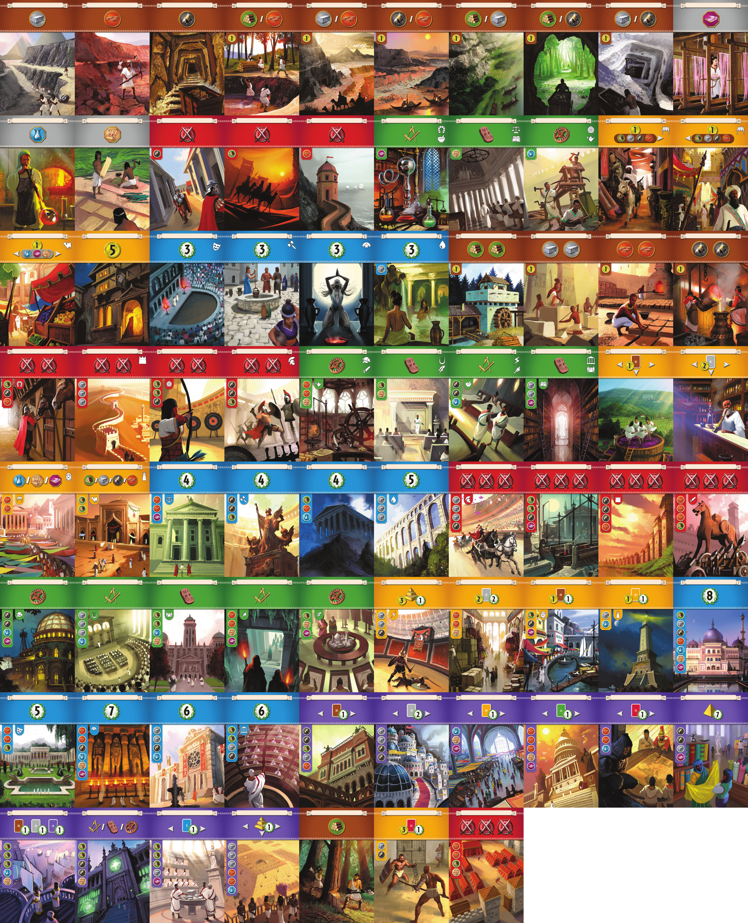
  • Original image of cards are 2550px wide, game has it downsized to 1280px. Because it is not a scale of 2 (1275 would be), browser has to distort the image and it brings pixelated and blurry images. Take a look at them and zoom in - all are pixelated and have some quality loss by default but when you have to resize it down to 49.5% it makes things even worse. https://x.boardgamearena.net/data/theme ... rds_v2.jpg
  • Red shields on red backgrounds are very hard to look at, it's too bright and has too high contrast
    shields.png
    shields.png (57.51 KiB) Viewed 3153 times
  • All card icon backgrounds are not optimized for web. They are too bright, have unnatural glint, and icons on top of them are hard to read, outlines are blurry
    background.png
    background.png (51.64 KiB) Viewed 3153 times
  • Wonder costs are on dark background, ore is also very dark - it's hard to understand where is the price when it's black on black. Previous edition had white border around icons and it was easier to read. All cost icons in general, as well as board symbols, are 20-40% smaller than last edition. Being of low quality and blurry, it's hard to distinguish them
    cost.png
    cost.png (51 KiB) Viewed 3153 times
  • Wonder names on boards are barely readable - all pixelated and not sharp at all
    boards.png
    boards.png (29.9 KiB) Viewed 3153 times
  • War icons are a complete mess. All have almost the same size, numbers 3 and 5 are extremely similar. Again, blurry and pixeled
    war.png
    war.png (31.03 KiB) Viewed 3146 times
  • New design is super flat and has gradients which makes everything look a bit plastic, while previous edition had textures and volume. They felt more real as cards even those are just images
In general, main problem that it's now sharp enough. Of course you can see all symbols and read them if you have perfect eyesight, but you really have to strain, focus, and concentrate to get the information out of the image. Previous edition didn't have this problem - all info could be scanned with a glance. Here you really have to look. And many people don't have good eyesight, or it's dark in the room, or their laptops/computers are old and don't have the best graphics. So for them it is even harder.
User avatar
Tadachini
Posts: 45
Joined: 23 June 2020, 21:28

Re: Give us back 7 Wonders

Post by Tadachini »

And take a look at old designs for comparison. They are pixelated as hell too, but they are easy to view, don't have too much brightness, have outlines and good background colors. Absolutely no additional eye strain besides pixelated images
shields.png
shields.png (73.82 KiB) Viewed 3142 times
icons.png
icons.png (54.1 KiB) Viewed 3142 times
background.png
background.png (58.99 KiB) Viewed 3142 times
board.png
board.png (21.28 KiB) Viewed 3142 times
war.png
war.png (28.92 KiB) Viewed 3142 times
User avatar
Wonderful Plays
Posts: 247
Joined: 20 September 2018, 13:06

Re: Give us back 7 Wonders

Post by Wonderful Plays »

Completely disagree. New edition is better in almost all the aspects, you will get used to new graphic design and you can still play old version.
User avatar
sorbbari
Posts: 2
Joined: 03 August 2020, 10:06

Re: Give us back 7 Wonders

Post by sorbbari »

Tadachini wrote: 12 September 2020, 19:26 Here you go, screenshtos are attached as reference.
Thanks a lot for the very thorough list and pictures. I agree with some of your gripes (dark symbols on dark backgrounds, icon size – these two are valid UI complaints) and disagree on others. I love the simpler look and flat design: for example, it really makes the military shields pop, and the black border on the military tokens makes them stand out more. Removing some of the busy background art & the superfluous glow and shadow effects is actually a huge net positive for game state readability.

A lot of your criticism applies to both the old and the new version (general blurriness, military token size). I think that's a bit disingenious. They're problems that stem from the limitations of BGA as a platform, not from the graphic design of the new edition.
Annalisa22
Posts: 1
Joined: 13 April 2020, 14:17

Re: Give us back 7 Wonders

Post by Annalisa22 »

MarioMinaccia wrote: 12 September 2020, 18:43 I would like to see something done about it: my proposal is to implement something like bga did for "Through the Ages", in which the "new" version was simply added as a completely different game.

This way you would not deprive the community of the Arena gameplay (now forced to the "new" version) or the ELO ranking (now completely incoherent, as it is calculated between two different games).
I totally agree, I think that the new 7W is a different game (cost of the cards, wonders, chains changed!) and should be treated as such.

While I am not fond of the new graphics, I don't particularly dislike it either. What I find quite annoying is that the effects of the wonders are not shown when one has to choose the wonder side (given that I don't know the new effects...), and that the card costs are not displayed anymore in the cards/chains summary below the game boards.
User avatar
Miracinonyx
Posts: 2
Joined: 19 June 2020, 07:07

Re: Give us back 7 Wonders

Post by Miracinonyx »

I don;t have much issue with the new cards (I don;t like them but I can adapt). My issue is that the old version worked smoothly, the new one has lag so badly towards the end of each game it is difficult to play.
User avatar
augustjologs
Posts: 52
Joined: 12 July 2018, 04:22

Re: Give us back 7 Wonders

Post by augustjologs »

I agree on some 'visual' complaints. The color contrast and sharpness make the new images of the New Edition a little harder on the eyes, but I'll get used to it eventually. But there are some that caused visual confusion on my part (I'm playing on 22 inch monitor):

1. The 3-point and 5-point military victories are so visually similar in size and appearance that one can mistake one for the other at a glance unless player spends a precious second or two to visually ascertain them.

2. The card titles are hard to read as the fonts are too small. I even mistook an Age 1 military card Guard Tower for Barracks (I had to double check the resource cost to make sure what it was, even then the resource icon are not that easy to differentiate either).

It's mostly BGA's visual translation to screen of the New Edition that I'd like to see some improvements. The New Edition as a game, I think is a great improvement over the older version.
User avatar
Tadachini
Posts: 45
Joined: 23 June 2020, 21:28

Re: Give us back 7 Wonders

Post by Tadachini »

sorbbari wrote: 12 September 2020, 21:45 Thanks a lot for the very thorough list and pictures. I agree with some of your gripes (dark symbols on dark backgrounds, icon size – these two are valid UI complaints) and disagree on others. I love the simpler look and flat design: for example, it really makes the military shields pop, and the black border on the military tokens makes them stand out more. Removing some of the busy background art & the superfluous glow and shadow effects is actually a huge net positive for game state readability.
I love new art too and find that the game has improved in many aspects. Probably on print it feels great when you hold it in your hands. But it is absolutely not optimized for web. Colors are all messed up, contrast is off, a lot of blurry edges and everything is sooo small :(.
sorbbari wrote: 12 September 2020, 21:45 A lot of your criticism applies to both the old and the new version (general blurriness, military token size). I think that's a bit disingenious. They're problems that stem from the limitations of BGA as a platform, not from the graphic design of the new edition.
I know that classic BGA version has the same problems like token size or blurriness. But classic version was done I think 2 or 3 years ago, new one is super fresh. So new one in my opinion should have much better graphics and solve the problems that the old version had. It's not about tech limitations they don't have such restrictions (I saw BGA code, the platform can do anything), there are plenty of HD websites that have stunning graphics (no need to go far, visit apple.com and compare visuals). So in my world, it does come from the graphic design and it's adaptation to the web. Although maybe this adaptation was done by Repos and not BGA, here I don't know who gave source images and so on.
Post Reply

Return to “7 Wonders”