Icons are so small and indistinguishable

Forum rules
Please DO NOT POST BUGS on this forum. Please report (and vote) bugs on : https://boardgamearena.com/bugs
User avatar
theTickler
Posts: 4
Joined: 28 June 2022, 18:45

Icons are so small and indistinguishable

Post by theTickler »

This is directed at the board game designers, not BGA devs.

Wow. The icons are crazy-small, and they're all the same color, and they're not intuitive, and it's very tedious trying to discern actions and meanings with all these teeney, confusing icons all over the place.

For example, the Upkeep icon. I have to zoom in to see what it's supposed to be. Oh, it's a book? It would be better to just use the word "Upkeep" on the cards and wherever else this is used.

And why make them so small???

I would never buy this game if this is what the cards and game text looks like. Make the cards bigger if you have to. If I purchased this game, and the cards looked like that, I'd be mad, and I'd return it.

Was the hard copy of this game even beta tested at all, with real testers? (i.e. not just friends and family who will say everything is great.)

It's a real shame, because the artwork is AWESOME, and I love the theme, and it seems like a game I would buy if it wasn't for the awfully small and indistinguishable, tedious, confusing icons. If I was to play this IRL, I'd have to have a magnifying glass on the table. And that's not fun.

I hope you come out with a second edition and fix this. I can't be the only person who gets frustrated by this. Most people probably just ditch the game and never play it again (and certainly don't buy it after seeing how terrible the icons are).
denathil
Posts: 1
Joined: 14 August 2025, 19:57

Re: Icons are so small and indistinguishable

Post by denathil »

A bit of a belated response (as I'm still new to BGA here and didn't even see the forum bit til just now)
Let me start with, boy oh boy. You may not be the only person who thinks the icons/text are too small, but you sure are the first on my list of folks I wouldn't want to talk any games with as this just breathes insufferable levels of expectation to your personal needs.

I have at this point run a local scene for months now and the only people who had issues for one session was an older fellow with less than perfect eyesight so maybe that's the issue you have. Otherwise, depending on the size of your screen cards will display smaller and harder to read. Pull up the pagan play network site in a separate window and you can look up whatever card you might be having issues with. Rather than complain, and do so poorly, find solutions if you want to try and say you'd love something but put no effort into it.

I don't know how many card games you play, but the font on the physical cards, even the icons, are fairly standard from the ones I bring to the table. Being a competitive card game it very much becomes a matter of knowing what the card does rather than stopping to read it every time it gets played, and genuinely rewards getting fundamentals squared away and then polishing your playstyle but your passage here reads more of "I don't want to take the time to learn".

Now before you think I'm just a fan boy coming to yell at you for throwing mud at the game, I'm in no way personally associated with the company, have actively pointed out actual MECHANICAL issues I've seen with the game and will continue to do so. I actively put my name behind the game as a product that I am willing to recommend to those who are interested in this kind of social deduction, bluffing, and sequencing game.
richardforbeau
Posts: 9
Joined: 10 April 2025, 20:49

Re: Icons are so small and indistinguishable

Post by richardforbeau »

I wanted to give a try to this game since it's featured in the monthly event, but I have to say that, compared to other games I play i find it really confusing graphics-wise, and reading anything hurt my eyes after a while. The right side board that is supposed to explain all icons looks out of focus on my screen and I can't read it.

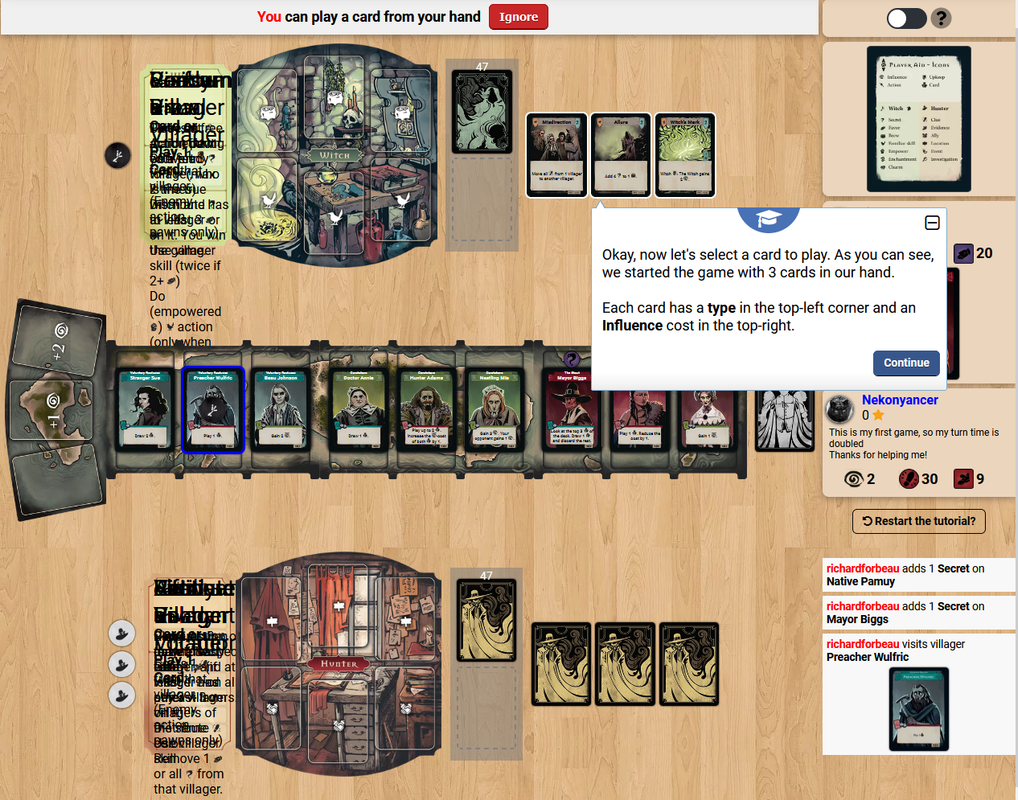
Also, does anyone else get this scrambled text on the left? Looks like several text layers were superposed..?


Image

Tried to change resolution, zoom in/out, or find some settings to solve that, but nothing worked :(

My screen resolution is 12801024, standard 60hz.
User avatar
kuhajo
Posts: 1
Joined: 06 February 2021, 00:27

Re: Icons are so small and indistinguishable

Post by kuhajo »

I agree. The cards, and thus the symbols on them, are way to small, and zooming in the browser doesn't change the size of the cards, so it doesn't help. The only chance to see something is to hover over the card to get the detail view. The player aid also looks a bit blurry, btw. My screen resolution is 3440x1440.
User avatar
Zmora
Posts: 9
Joined: 21 November 2024, 20:27

Re: Icons are so small and indistinguishable

Post by Zmora »

Agreed. I have an ultrawide monitor and they're still too small to distinguish without hovering with my mouse to toggle a tooltip. The developers need to give this game a redesign, I think. It seems really fun to play though.

Edit: Oh wow, I just looked the game up and they have multiple expansions, so it appears most people have no trouble at all with the teeny icons. I guess my age is showing? Seriously though, they all look like blobs to me.
muchsarcasm
Posts: 4
Joined: 21 July 2025, 09:33

Re: Icons are so small and indistinguishable

Post by muchsarcasm »

I have to agree with not much liking the icons and their size. Because there is full English on the cards minus the icons, it feels like the icons aren't needed. In other words, "Play 1 card" isn't that much longer than "Play 1 [icon]". Combine that with there being over a dozen icons doesn't help. In the grand scheme of things it's not a big of deal. BGA gives a full reading of each card, but it would be nice to have it clear off the bat.

Anyway, this game does look like a lot of fun; and I'll definitely try it out.
RichLather
Posts: 1
Joined: 22 June 2025, 23:56

Re: Icons are so small and indistinguishable

Post by RichLather »

Honestly, at this point all I need to know is how to see , as the Witch, who my secret identity is supposed to be throughout the game.

EDIT: It's in the sidebar, I got it.
User avatar
theAudsMustBeCrazy
Posts: 49
Joined: 01 August 2021, 03:00

Re: Icons are so small and indistinguishable

Post by theAudsMustBeCrazy »

Agree 100%
muchsarcasm
Posts: 4
Joined: 21 July 2025, 09:33

Re: Icons are so small and indistinguishable

Post by muchsarcasm »

When I posted earlier I thought the "hover over" text would lack the icons (or at least have text along with the icons). In other words, if a card said "Add 2 {secrets icon} to a {brew icon}" hovering over would show "Add 2 secrets {secret icon} to a brew {brew icon}" it would be quite helpful. It's a certainly a fun game, just occasionally difficult to read through. Hopefully a change gets added in a future update.
User avatar
reiaria
Posts: 1
Joined: 05 March 2025, 10:37

Re: Icons are so small and indistinguishable

Post by reiaria »

Agreed. In the beginning it took me ages to figure out what some of them mean. Of course it gets easier with more ganes under my hood but I'd also love a different execution to make things that much more clear.
Post Reply

Return to “Pagan: Fate of Roanoke”