This is directed at the board game designers, not BGA devs.
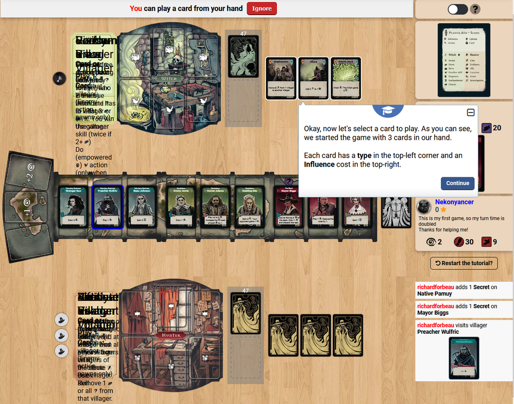
Wow. The icons are crazy-small, and they're all the same color, and they're not intuitive, and it's very tedious trying to discern actions and meanings with all these teeney, confusing icons all over the place.
For example, the Upkeep icon. I have to zoom in to see what it's supposed to be. Oh, it's a book? It would be better to just use the word "Upkeep" on the cards and wherever else this is used.
And why make them so small???
I would never buy this game if this is what the cards and game text looks like. Make the cards bigger if you have to. If I purchased this game, and the cards looked like that, I'd be mad, and I'd return it.
Was the hard copy of this game even beta tested at all, with real testers? (i.e. not just friends and family who will say everything is great.)
It's a real shame, because the artwork is AWESOME, and I love the theme, and it seems like a game I would buy if it wasn't for the awfully small and indistinguishable, tedious, confusing icons. If I was to play this IRL, I'd have to have a magnifying glass on the table. And that's not fun.
I hope you come out with a second edition and fix this. I can't be the only person who gets frustrated by this. Most people probably just ditch the game and never play it again (and certainly don't buy it after seeing how terrible the icons are).
Wow. The icons are crazy-small, and they're all the same color, and they're not intuitive, and it's very tedious trying to discern actions and meanings with all these teeney, confusing icons all over the place.
For example, the Upkeep icon. I have to zoom in to see what it's supposed to be. Oh, it's a book? It would be better to just use the word "Upkeep" on the cards and wherever else this is used.
And why make them so small???
I would never buy this game if this is what the cards and game text looks like. Make the cards bigger if you have to. If I purchased this game, and the cards looked like that, I'd be mad, and I'd return it.
Was the hard copy of this game even beta tested at all, with real testers? (i.e. not just friends and family who will say everything is great.)
It's a real shame, because the artwork is AWESOME, and I love the theme, and it seems like a game I would buy if it wasn't for the awfully small and indistinguishable, tedious, confusing icons. If I was to play this IRL, I'd have to have a magnifying glass on the table. And that's not fun.
I hope you come out with a second edition and fix this. I can't be the only person who gets frustrated by this. Most people probably just ditch the game and never play it again (and certainly don't buy it after seeing how terrible the icons are).